A Little or No Breeze 2021 Philip Miller and Joy Gregory
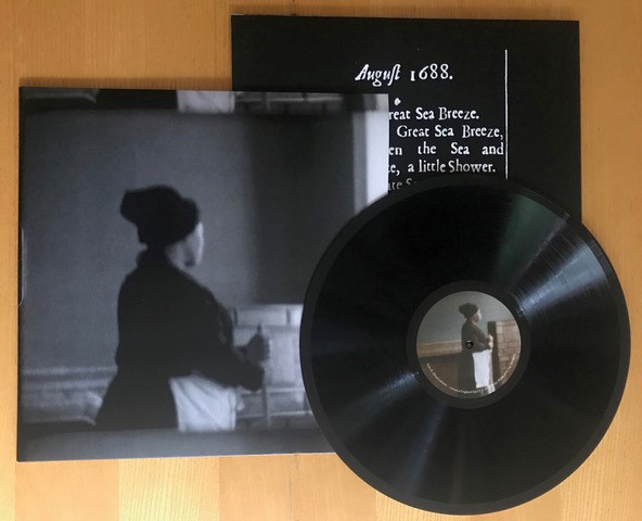
Image: A Little or No Breeze 2021 Philip Miller and Joy Gregory Vinyl record with sleeve 31 x 31cm cover image : Joy Gregory 2021 stills from A Little or No Breeze
Edition of 10 vinyls £200 each + 4 vinyls with artist's print (see below) £800 each
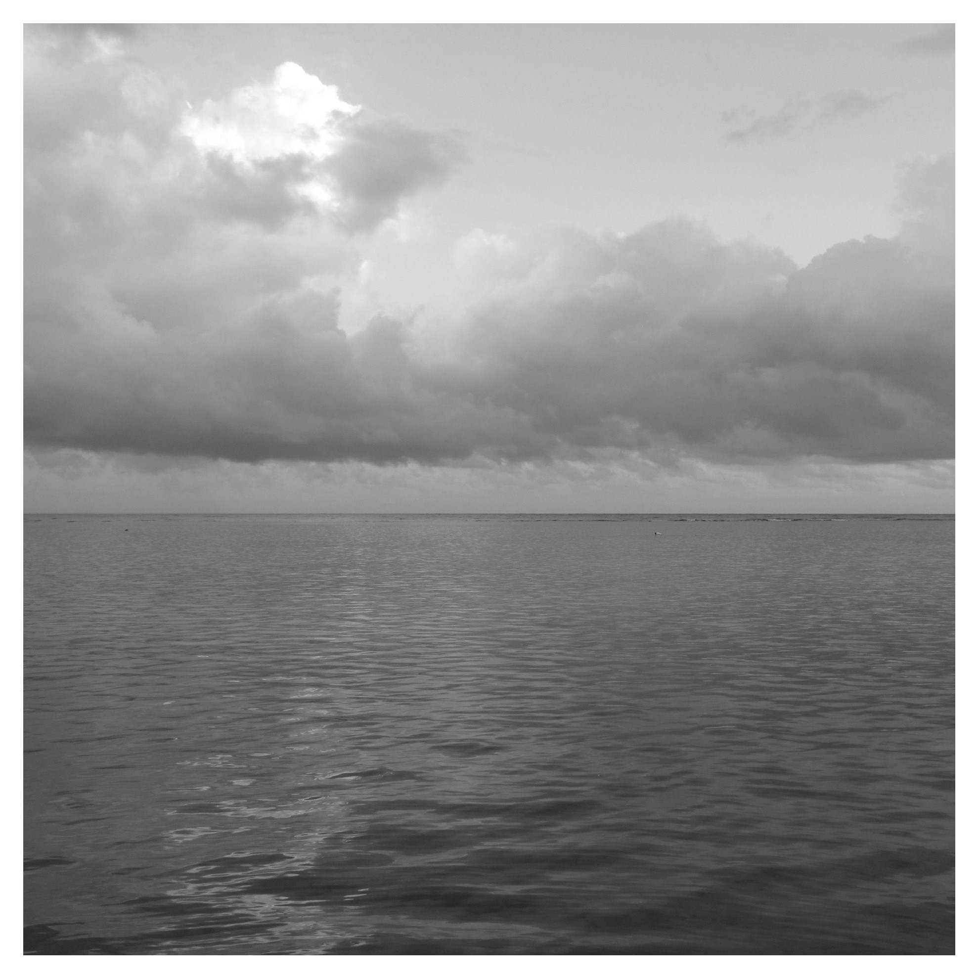
Image: Still Breeze 2021 Joy Gregory archival digital print on fine art paper 30 x 30cm edition of 7 + 2 A/P from no 5 £750
Produced on the occassion of the exhibition by Joy Gregory and Philip Miller SEEDS OF EMPIRE : A Little or No Breeze presented at Danielle Arnaud 5 June until 22 September 2021. Side A : A Little or No Breeze, Observations - Jamaica/England: Part I Side B : Observations - Jamaica/England: Part II Music published by Mute Song Limited.
[PORTFOLIOS]
Etruscan Children series 2021 Oona Grimes
Badly behaved Etruscan puppets shaken, stirred, knitted
and knotted in a chapter of fuzzy felt diptychs.
Attempting escape from the clutches of brutal parental figures and their
hooked sticks, blank faced eluding time and punishment.
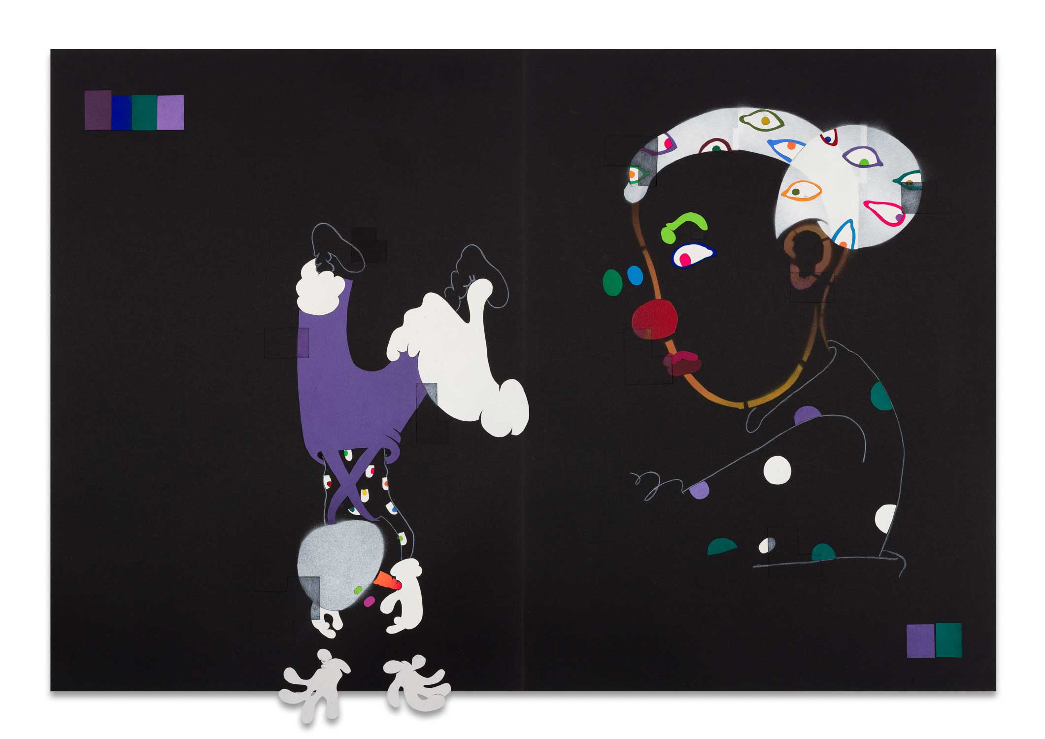
Image: Oona Grimes Etruscan
Children #5 2021 spray paint, collage and coloured pencil
drawing 76 x 112cm £1800 each + VAT
PLEASE CLICK HERE TO VIEW THE WORK AS PDF
Etruscan puppets series 2021 Oona Grimes
Psychotic Etruscan puppets get Pasolini on the set of Salo
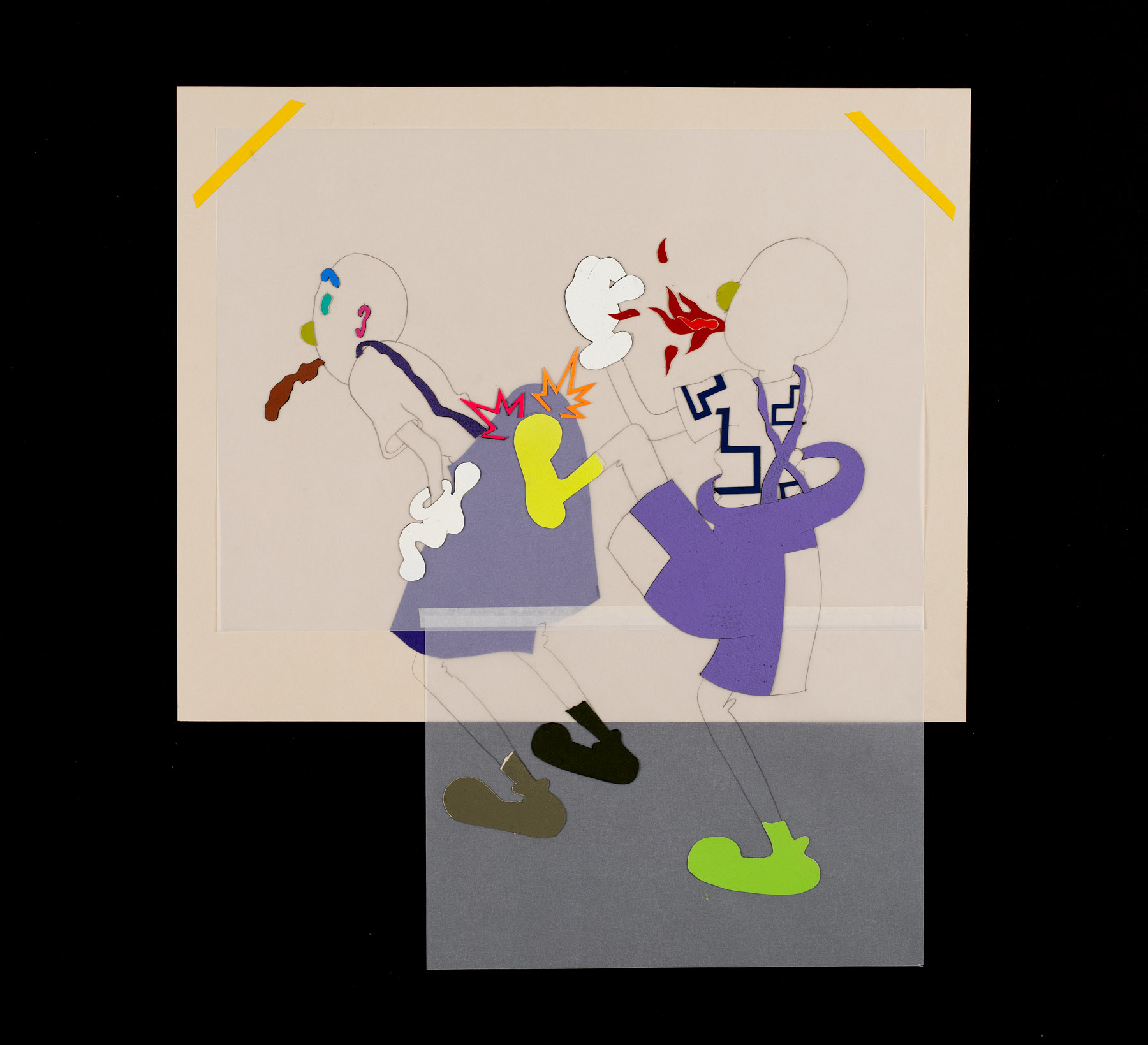
Image: Oona Grimes Etruscan
Puppets #23 2021 pencil, spray paint and collage on paper
52.5 x 47cm £800 each + VAT
PLEASE CLICK HERE TO VIEW THE WORK AS DOWNLOADABLE PDF
CLICK HERE TO VIEW
THE CATALOGE WITH PURCHASE OPTIONS
A Christmas Selection
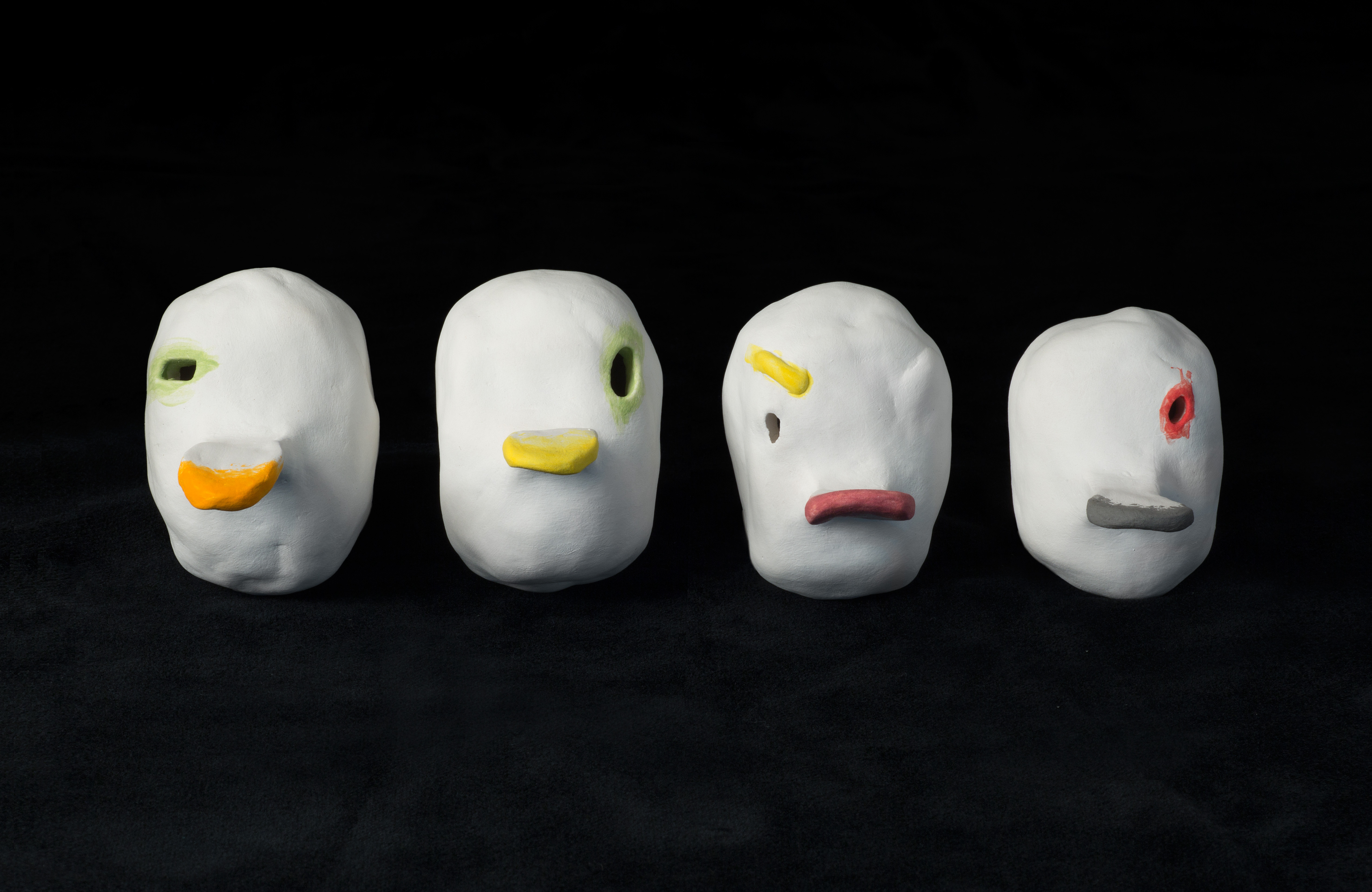
Image: Oona Grimes the
chorus (duck) 2020 clay and coloured slip 9 x 6.5
x 4.5cm each £600 each + VAT
The gallery is delighted to present a series of portfolios
of new and recent available works, continuing with a portfolio to accompany
the physical and virtual exhibition A Christmas Selection.
PLEASE
CLICK HERE TO VIEW THE WORK
To close this unusual year, the gallery decided to revisit 1995 and present
an exhibition of works in a domestic setting, a salon ambience reminiscent
of its beginnings, 25 years ago. Recent and new works by the gallery artists
and artists due to show in 2021/22 are brought together, without a theme,
following the simple rule of aesthetics: what works together will be together!
The show will only be open by appointment but tea and cake, or aperitif,
will be served to the intrepid visitor. All the works are for sale, reminding
the audience that artists and galleries need some help too.
December 2020 Oona Grimes
Image: Oona Grimes The
children #9 2019 A4 coloured pencil on paper 21
x 29.7cm £600 + VAT
The gallery is delighted to present a series of portfolios
of new and recent available works, continuing with a portfolio of work by
Oona Grimes.
PLEASE CLICK
HERE TO VIEW THE WORK
Oona Grimes is a
London based artist, primarily a chaser of language through drawing and
clay making.
During Grimes’ 2018 Bridget Riley Fellowship at The British School at Rome
she segued from thieving Lorenzetti tartans and cartoon detail from Etruscan
paintings, to the appropriation of neorealist films – mis-remembered, imitated
and low tech re- enacted: a physical drawing of herself captured on i-phone.
“You’re lured inspite of yourself, inspite of not knowing what the shady
characters and disjointed hieroglyphics represent... Isn’t this what Grimes
is seeking – a way to notate a reality that can’t be determined or resolved
through narrative or catharsis?” - Cherry Smyth
Her drawings are a celebration of the absurd, a transformation of ordinary
objects & a simmering consomme of fact & fiction, an ongoing series
of parallel worlds. They are an investigation into language, beginnings &
ends of it, learning & losing it, neurological case studies, alzheimers,
slippage & mis-memory. Clay is the in between bit – the instinctive
making-ness that fills in the gaps
“Now tanglehead has nothing to say to brickface. Characters once locked
in the personalities of hierarchical position must change as the power of
speech is lost.” - Cherry Smyth
November 2020 Antonio Riello
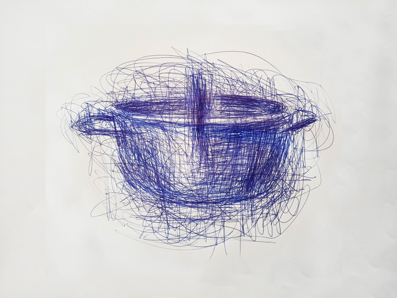
Image: Antonio Riello
CONFINED TOOL 81 2020 blue BIC ink on paper 29.7
x 42cm £900 + VAT
The gallery is delighted to present a series of portfolios
of new and recent available works, continuing with a portfolio of work by
Antonio Riello.
PLEASE CLICK
HERE TO VIEW THE WORK
Antonio Riello's Quarantine drawings are a very personal and
tormented form of reportage of his kitchen-scape. He started obsessively
reproducing kitchen tools and objects during lockdown. Just humble sketches
of course but, all together, they become a great "Visual Dictionary of Quarantine",
a sort of Late Modern Enlightment-style Encyclopaedia. The taxonomic classification
of every "creature" reveals Riello's passion for Mark Dion’s research; the
main idea is to set up an Anthropological Museum of culinary ergonomy and
cruelty. They are not only a way of witnessing a weird time but also a devoted
and oblique homage to the beloved Alberto Giacometti and his drawing style.
All the drawings are made by blue ink BIC pen (the very same that Alighiero
Boetti loved so much to use in the ‘70s) on humble paper (A3 size). The
artist believes we need "ordinary" tools to be able to imagine "extraordinary"
adventures.
Born under the sign of Lion in Venezia,
Antonio Riello is one
of Italy’s most eclectic and controversial artists, working in techniques
as varied as sculpture, design, photography, installation and video games.
Incorporating the ironic manner of a conceptual charade, Riello manipulates
and almost mistreats the images and objects which he invents. A controlled
degree of ambiguity is the typical signature of his artistic research.
He has exhibited his work in several museums and institutions including:
BALTIC (Gateshead UK); nGbK (Berlin D); Kunstverein Neuhausen (Neuhausen
D); MART (Rovereto I); MAMC (Saint Étienne F); Kunsthalle Wien (Vienna A);
Fondazione Arnaldo Pomodoro (Milano I); Palazzo delle Papesse (Siena I);
Neue Galerie (Graz A); Kunstverein Wolfsburg (Wolfsburg D); Centro Pecci
(Prato I); Kunstverein Freiburg (Freiburg D); Kunsthalle zu Kiel (Kiel D);
Chelsea Art Museum (New York USA); Elgiz Museum (Istanbul TR); GAM (Torino
I); Museum of Arts and Design (New York USA); mudac (Lausanne CH); Museo
Civico di Bassano (Bassano I); Musée Ariana (Genève CH), Museum Der Welt
(Berlin D); Dordrechts Museum (Dordrecht NL); Glastress, Fondazione Berengo
(Venezia, I).
October 2020 Abraham Kritzman
Image: Abraham Kritzman
The Ravine Left 2019 diptich oil on wood each
40 x 30cm
The gallery is delighted to present a series of portfolios
of new and recent available works, beginning with a portfolio of work by
Abraham Kritzman.
Please click
here to view the work.
By means of cutting, fragmentation, and layering, Abraham Kritzman (b. 1983)
alludes to various experiences he had in 2015, while wandering and hiking
in Piatra Neaț , a city in the Moldavia region of Romania, where his great-
grandfather lived years back. During his journey he collected elements,
which are woven together to form artworks akin to remnants of myths that
carry cultural baggage. That baggage, in turn, functions as a foothold that
is tempted to extract a moment of clarity from a dense, tortuous existence.
Abraham Kritzman
(born 1983) is an artist living and working in Tel Aviv. He is currently
a Lecturer at Bezalel Academy Jerusalem, and teaches in the Tel Aviv Museum
workshops in Tel Aviv. He is also a member and curator of Barbur Gallery
Jerusalem. Until 2016 he was also a Lecturer at The Visual Art School Kaye
College Beersheba. Abarahm has an MA from the Painting Programme at the
Royal College of Art (2014). A BFA with honours from Bezalel Academy of
Art and Design Jerusalem (2011) including one semester at the UDK Berlin.
[SELECTED ARTWORK]
December 2020 Nicky Coutts Mimics
series 1
with a text by Tess Charnley
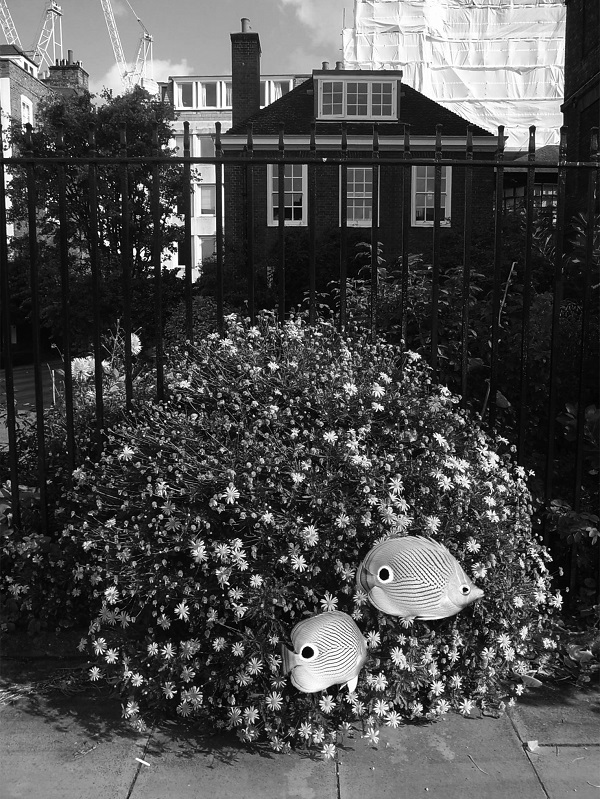
Image: Nicky Coutts Mimics series 1 2015 photo etching on Somerset paper 13 x 17cm Edition of 5 + 1 A/P from £650 + £65 VAT (framed)
Mimicry is a powerful tool for survival. Like chameleons, octopuses change colour to match their backgrounds when sensing predator or prey; the harmless milk snake mimics the colouring of the venomous coral snake to ward off other animals; and the foureye butterflyfish has dark spots resembling eyes on its body, confusing potential predators. The latter is an example of ‘automimicry,’ when one body part of an animal mimics another, giving the animal a better chance of surviving an attack. Nicky Coutts Mimics series 1 speaks to this type of mimicry, using imagery of mimetic animals to evoke ideas of the similarities between animal and human use of mimesis when resorting to manipulation to survive.
A series of five photo etchings on Somerset paper,
the work presents animals superimposed onto different photographs taken
of the outdoor area at Lincoln’s Inn, the UK’s largest concentration of
lawyers’ chambers. Owl butterflies grasp onto a set of wrought iron railings,
spider-web like in the intricacy of their metalwork. An oriental flying
gurnard glides above the surface of the grass; the air its water, the ground
its seabed, while a sun bittern moves across the same grass, outstretched
wings reminiscent of a judge’s robes. A serval looks towards the building,
its attention focused, waiting, and two foureyed butterflyfish float across
the surface of a bush. Each of these animals has eyespot markings, their
automimicry creating a sense of omnipotence in this judicial environment.
They become even more mimetic in Coutts’ depiction of them, flattened against
the background in their black and white camouflage. There is a parallel
drawn between the mimesis of the animals and the mimesis of the lawyers
residing in the chambers here; a profession where alertness and the ability
to camouflage intentions and adapt to quickly changing surroundings for
the sake of one’s (or one’s clients) protection is fundamental. Coutts underlines
the intrinsic instinct to shapeshift, present in humans and animals alike.
PLEASE CLICK HERE TO VIEW THE WORK
August 2020 Louisa Fairclough Bore
Song
with a text by Tess Charnley
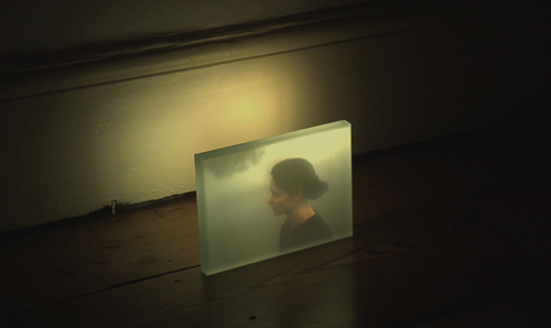
Image: Louisa Fairclough Bore Song 2011 16mm film loop with sound projected on float glass Edition of 3 £6000 + £600 VAT
and I find you in the reeds, a trickle coming out of a bark, a foal of a river - Alice Oswald, Dart
Louisa Fairclough’s Bore Song speaks grief’s
language to those who know it, and cannot fail to move those who don’t.
I watch it in early June, days before the third anniversary of my mother’s
death and I have to look away. As the figure in the film calls to the water,
a discordant minor note, something in the work meets a primal sense of loss;
a need to shout, to call out to a presence beyond response. I return to
it weeks later and this time can watch it repeatedly, able to notice its
nuances, to appreciate it beyond self-identification. In this way, my experience
with the work mimics the pattern of grief itself. Sometimes it overwhelms
you, its rawness an eruption. But mostly it is just there, a hum in your
existence. The sound of water lapping on the shore. Grief is often compared
to a wave and in Fairclough’s film the metaphor becomes literal. A bore
tide surges, the singer (the bereaved) surrounded but not submerged.
The materiality of the work, and the form of its
presentation, is crucial. First presented at the gallery in 2011, it was
shown alongside Song of Grief, the sounds of the two works merging
to create a minor sixth. The film is projected onto float glass, its ephemeral
quality a manifestation of the slippery nature of bereavement. This is a
work of loss, yes, but mostly of human experience; of the melancholy song
we all sing, at some point or another.
Please click here to view the work.
May 2020 Kihlberg & Henry Formations
with a text by Tess Charnley
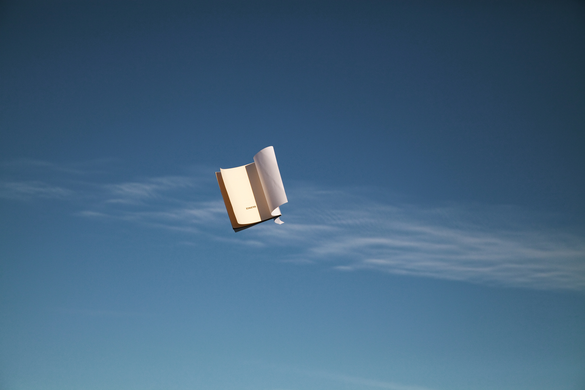
Image: Kihlberg & Henry Cirrocumulus Stratiformis with Silence from Formations 2013 Series of 4 C-type prints 37.5 x 55cm Edition of 5 £550 unframed + £55 VAT
Kihlberg & Henry’s Formations series feels like an act of trickery, an illusion, a moment beyond what is usually conceivable. We are used to a concrete, yet invisible, dividing line between land and air. Birds belong in the sky. Planes live there too, although they do not necessarily belong. But books exist stacked or singularly - on shelves, in bags, between sheets. Through these photographic compositions, Kihlberg & Henry transgress this boundary. Propelling books into the sky, they capture them mid-flight - the camera’s shutter providing our insight into a moment otherwise unseen. Layered against cloud formations, the books exist beyond their usual surroundings - the wind spreading their pages in the same way that they would be soaked by the sea.
The works’ titles are amalgamations of the names
of the books and the names of the cloud formations, the individuality of
each one mirrored in the other. John Cage’s Silence is flung into
a Cirrocumulus Stratiformis formation, its quiet, stretched out layers evoking
the fragility of silence, how it can prolong the gaps between us. Marshall
Berman’s book All That Is Solid Melts into Air sits against
Cumulus Congestus and Pannus formations, the solidity of its outline matched
by these thick clouds, their looming hint of rain showing no signs of melting.
Although there is something surreal in the sight of books among the clouds,
in other ways this pairing makes perfect sense - both the acts of reading
and cloud gazing a form of meditation, the transience of which can only
be half-captured in the stillness of photography. The unfurling movement
of the clouds, or the books falling from them in a perfect arc, I like to
imagine, exists in our imagination beyond the work, beyond what the camera
lets us see.
Please click
here to view the series.
March 2020 Suky Best
The Sea House
with a text by Tess Charnley
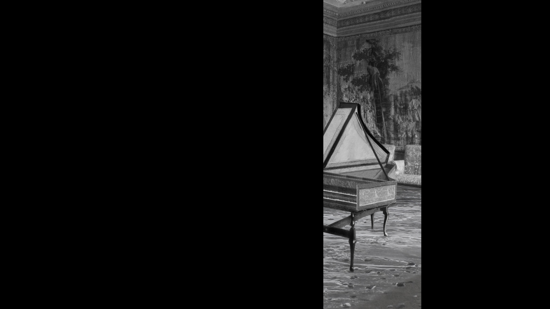
Image: Suky Best The Sea House 2014 7 minute looping animation with sound Edition of 5 + 1 A/P No. 4 available £5000 + VAT as applicable
Suky Best’s animation, The Sea House (2014), begins as it ends; a black screen enveloped by the sounds of the sea. The work is an animation; images of historic interiors collaged with live footage of the sea. Each separate interior in the animation has its own individual sea; some swelling and crashing, others gently lapping at the carpeted coast. At one point the sea even seems to emerge from the mouth of a fireplace, water-logging piano legs, its wildness threatening this man-made fragility. The work’s metronomic effect emerges not only from the sea soundscape but from the moving slit in the image, revealing the visual collage only in fragments, allowing us to peer into this collaged world through a segment of a screen that is primarily black. The obfuscation focuses our gaze on the details of the interiors; our eyes following the slit in the screen, left to right and back again, in the same way they might follow a hypnotist’s pendulum. The collaging is intentionally clunky in places, adding to the surreal nature of the work - we know the sea has not actually invaded these rooms but can we be sure? The fact that the work is in black and white confuses this further; we register the sea on the same visual plane as the room’s interiors, the only clue of its fictitiousness in the collage’s disjunctions.
I watch this work on my third day of self-isolation
during the quickly progressing public health crisis, COVID-19. Half an hour
passes and I find that I have watched the animation on loop, four times.
There is something mesmeric about it, something soothing in a time of such
high-anxiety. This is partially the magic of the sea, its healing qualities
effective even through the transposition of its sound into a London flat,
where in confinement I could not feel further from its salty sting. It is
a metronome, marking the passing of time with its tides; with the soporific
rumble of its body, retreating outwards and crashing inwards - dredging
up and vanishing the grit from its bed, all in the same breath. The white
noise of the sea underpinning Best’s animation draws us into the work’s
imagery; lulls us into a rhythmic looking. At a time when many of us are
facing empty rooms, we can take comfort in this work, rocked in our homes
by the work’s lulling sounds.
Please click here to
view the work.
January 2020 Polly Gould
Alpine Architecture: Dent du Géant
with a text by Tess Charnley
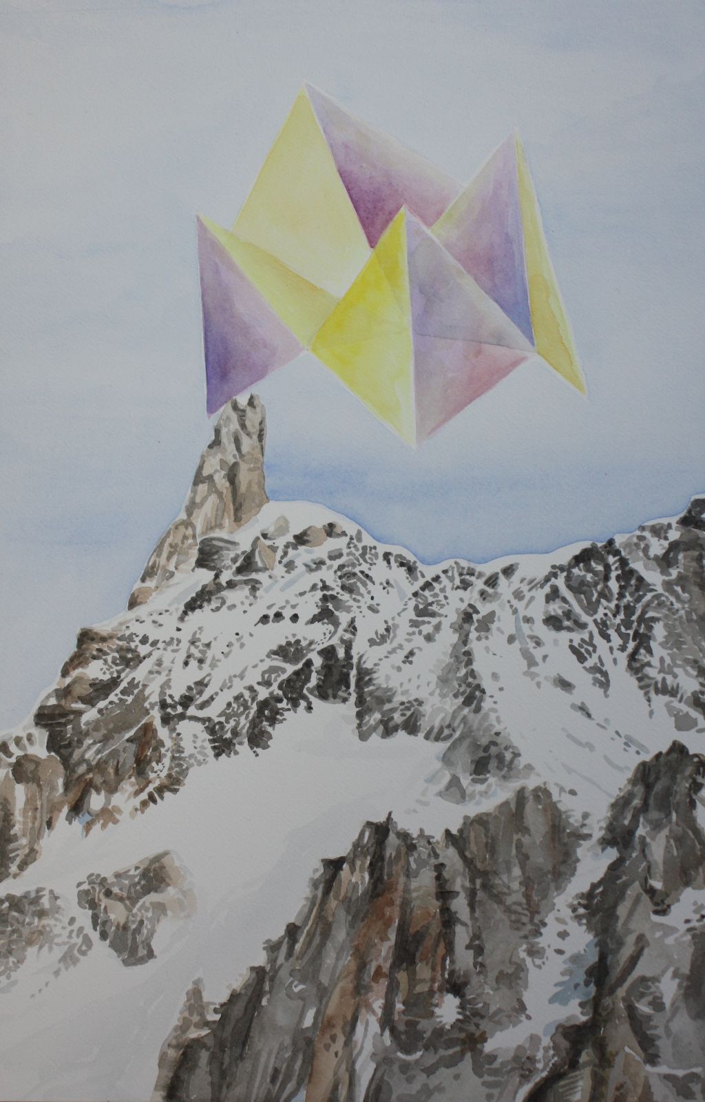
Image: Polly Gould Alpine Architecture: Dent du Géant 2017 Watercolour on paper 35 x 54.5cm Sold
The mountain Dent du Géant, part of the Mont Blanc massif, translates as ‘Giant’s tooth’. A craggy canine cutting through a snow-capped gum, Polly Gould’s choice of watercolour is unexpected here. The flatness of the medium softens the mountain’s extremity, lending the painting a dream-like quality; a climber’s mirage. In the tonal shifts of the mountain’s greys and browns, the negative space of snow, we almost forget what it would be like up there. The thin air and the freezing temperature; exhaustion overridden by determination.
On top of the mountain sits something strange, futuristic even; a purple and yellow structure, almost half the size of the page. It is made up of individual pyramid shapes, tent-like, the translucency of the paint revealing their convergence to a central point. The nature of watercolour, with its subtleties and softness, acclimatises the viewer to the appearance of this alien structure in all its precarity, somehow managing not to tumble from view. Drawing on Bruno Taut’s conception of a utopian city in the alps, Gould presents us with her vision of refuge. A refuge not only from the elements but also, as art so often is, a refuge from the world around us - an architecture that we can duck into, removing ourselves from the ascension of our own lives, just for a moment. A tentative suggestion of utopia, balanced on the tip of a Giant’s tooth.
December 2019
Kathleen Herbert
They Take Us Away to the Thin World of the Future or the Underworld
of the Past
with a text by Tess Charnley
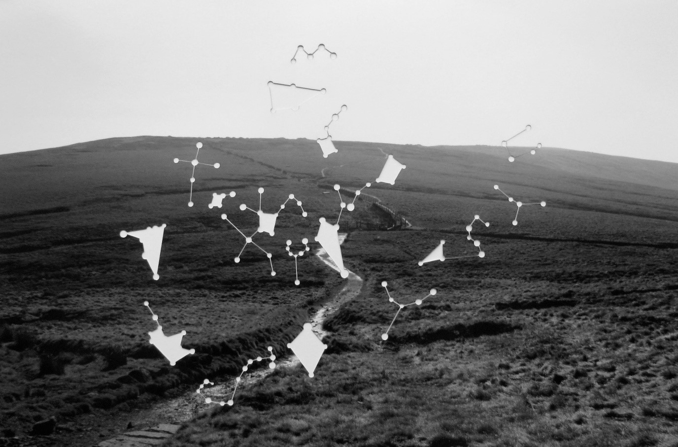
Image: Kathleen Herbert They Take Us Away to the Thin World of the Future or the Underworld of the Past VI 2013 Series of 12 black and white giclée prints, lasercut star constellation 44.5 x 57.5cm Edition of 5 From £660 unframed + £66 VAT
Paths are ways trodden; routes formed by the weight of bodies imprinting upon the earth repeatedly. In this series, the title of which is a quote by poet Edward Thomas, Herbert has photographed the landscape of the Peak District, where in 1932 approximately 500 walkers walked from Hayfield to Kinder Scout to challenge the right of landed gentry to enclose the countryside and to secure access rights to open country. These paths represent a shared history; a marking of humanity’s living amongst each other across generations and even lifetimes. Traces of our ancestors exist in our landscapes and we map traces anew. The idea of the future as a ‘thin world’ seems particularly relevant now, in the destructiveness of the ecological impact we have pressed upon the earth.
Herbert captures the landscape here in its fleeting state of fluctuation. As with all photography, we see a truth for the instant of the image’s exposure; its aura impossible to replicate. Herbert allows the viewer to project themselves onto the image, not only with their viewpoints, typically at eye-level looking out onto the landscape, but also with the way in which she has worked into the photographs after their printing. Each photograph of the series of twelve, for every month of the year, has been lasercut with one of the twelve astrological constellations. Without knowledge of the constellation patterns, this could at first appear to be a join-the-dots game or coordinates on a map, rather than coordinates on the celestial sphere. The fact that these constellations are cut out of the image, rather than overlaid, allows the viewer to project herself upon the image, choosing what can be seen between the stars. Constellations are mappings, points of orientation, but they are also invitations for imagination; sketches of lost pasts or imagined futures to be coloured in our continual quest to understand, to relate our position within the world. Herbert’s work here is a reflection of our desire to simultaneously evade and embrace the unknown.
October 2019 David Cotterrell
Mirror V: Translation
with a text by Tess Charnley
.jpg)
Image: David Cotterrell
Mirror V: Translation 2019 Single-channel video with
four-track audio Collaboration with Ruwanthie de Chickera Dimensions
variable Photograph by Oskar Proctor
Truth is a thing of this world: It is produced only by virtue of multiple
forms of constraint. And it induces regular effects of power. Each society
has its own regime of truth, its "general politics" of truth: that is, the
type of discourse which it accepts and makes function as true. – Michel
Foucault, Power | Knowledge, pp. 131
Translation shores up truth, moulding it into the outline of a specific agenda. Extending beyond words, translation clings to the visual and creates a rhetoric. In a society laden with visual signifiers, nothing can exist without subjective meaning, washed with our ideologies; our upbringings; the views of those with whom we surround ourselves. We see what we anticipate or what we fear, not what our eyes truly register. A backpack left on the tube, visibly filled with books or clothes, becomes a bomb even in its absence of wires. We transpose our fears into our surroundings, led by our prejudices in an absence of meaning. But in verbal or written translation, there is something about the definitive nature of writing, a suggestion of the contractual, that makes it perhaps even more powerful than our visual transpositions. The translation becomes evidence and is disseminated again and again, repeated as fact. The translator’s prejudice is poured between the words and made invisible, gluing the speaker’s mouth shut and branding them with new meaning.
David Cotterrell’s latest in his Mirror installations, Mirror V: Translation, explores the prejudice in translation, exposing how its nuances can mark the difference between perceived innocence and guilt; between a person portrayed as rightly frustrated with the immigration system, or as a terrorist. Cotterrell’s installation presents two Sinhala monologues, filmed in Sri Lanka, on screens in an otherwise dark room. As the viewer moves around the gallery space, they step beneath three ultrasonic speakers. Beneath each speaker they are engulfed by an invisible sonic bubble playing different translations of each monologue. The sound is ephemeral, as clear as though someone is whispering in your ear at one moment and then disappearing entirely with just a few inches of movement, simulating the wavering of truth in translation. The discrepancies between each translation initially seem minor but their cumulative effect is significant. In one monologue, our attention is triggered by words such as ‘recruiting’ and ‘bombing’, which we associate with terrorism. But in a different translation, this sinister suggestion of recruitment becomes a plea to join forces, and the word ‘bombing’ is eradicated completely. In this work, Cotterrell demonstrates how words can be weaponised both against the public in the media’s deliberate misleading, reframing and mistranslation to suit political agendas, but, most importantly, against the perceived ‘other’ in the subtleties of their demonisation.
August 2019 Sarah Woodfine
Untitled (Forest)
with a text by Tess Charnley
.jpg)
.jpg)
Image: Sarah Woodfine
Untitled (Forest) 2016 MDF, pencil on paper, Perspex
16x104x15cm £6000 + £600 VAT
But the wolves have ways of arriving at your own hearthside. We try
and try but sometimes we cannot keep them out. - Angela Carter, “The
Company of Wolves,” from The Bloody Chamber and Other Stories
This idea of keeping out the wolves, of trying to restrain the uncontainable, is entrenched in our relaying of fairytales. Stories, myths and tales may physically be contained within the bindings of books but their most potent telling is through the mouths of others. They exist in oral histories, with their books remaining as material reference points, words spilling out of the sides. As Angela Carter retells the fairytale of Little Red Riding Hood in her short story “The Company of Wolves”, Sarah Woodfine retells, interprets and revises both stories in her work Untitled (Forest), mirroring the mutation that the story undergoes when passed from mouth to mouth.
Woodfine plays on the (im)possibilities of containment here, with the forest enclosed within the parameters of the art display. Its perspex box seals its world, allowing viewers visual entry but safeguarding them from the wolves within. Blurring the boundaries between drawing and sculpture, between the three dimensional and the two dimensional, Woodfine creates a stage set on which the viewer can remember the chill of a cracking twig in an uninhabited woodland, of wolfish eyes piercing between your ribs. The sinister nature of the beast is alluded to here but undercut by Woodfine’s characters that straddle both the human and the wolfish, emerging as creatures in drag. In this hybridity, Woodfine both dispels the hierarchy between human and animal and alludes to the human tendency to dress up our violence and mask its primacy.
With the neatly cut tops of trees and amputated limbs, (bandaged feet and stumps where hands once were, take centre stage), executed with Woodfine’s sharp monochrome pencil, we could believe that these cuts were clean. But with the red cloaked by the graphite trees and seeping from between the legs of the central wolf, a mother figure perhaps, we see that even the forest cannot camouflage its violence and its loss. We are privy to the underbelly of the forest here and its cannibalistic nature. Woodfine’s forest is a site of the unconscious; a place of transformation but also reparation. The wolves look towards the malevolant figure on the right, anticipating their own transitions through the stages of the moon until they enter the snarl of its madness, limbs intact.
July 2019 Gerry Smith
Zoe
with a text by Tess Charnley
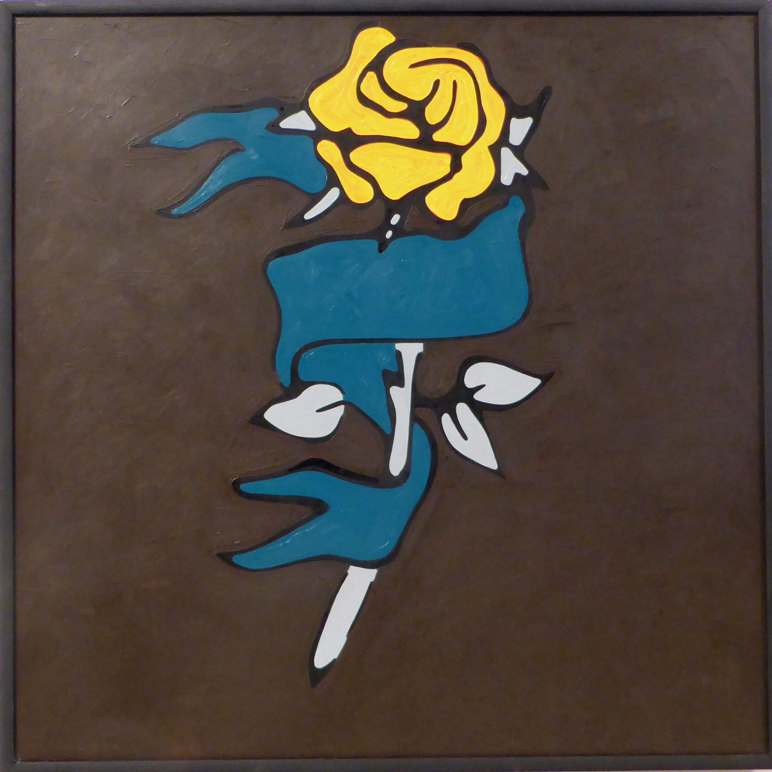
Image: Gerry Smith Zoe
2019 oil on board 61x61cm Sold
Gerry Smith’s house-cum-studio is brimming with art, both his own and the
work of other artists. The space is carefully curated, with close but playful
attention paid to the dialogues that arise between different works. On visiting
Smith, this is one of the first things we talk about; I learn about his
practice through learning about his home. Naming Belgian artist Marcel Broodthaers
as one of his primary influences, he references Broodthaers’ statement that
he liked to make art the way people arrange their mantelpieces. Smith alludes
to this literally in the arrangement of his own mantelpieces which are composed
with a combination of art and objects (some collected specifically for the
purpose of this positioning). The mantelpieces become works in themselves,
cabinets of curiosities. Subverting Broodthaers’ statement, Smith has arranged
them as people would curate a show or compose a painting. His interpretation
and evolution of this statement is akin to his practice; figurative yet
flat and washed with something a little humorous, something a little dark.
Before becoming an artist, Smith worked for several years as a gardener. He describes himself as ‘flower mad’ and flowers do crop up repeatedly in his paintings. His interest in flowers has evolved into a fascination with the strange simplicity of their portrayal in tattoos. Zoe is a painting of a rose, tattooed, and is typical of Smith’s style in its flatness. Rejecting layers, he paints each colour side by side, playing with the viewer’s perception. The strokes of Zoe’s brown background follow the outline of her rose almost like an aura, until they merge into their murky expanse. This technique creates tension between the marks, which Smith likens with the tension created when air touches water. He approaches art as something immersive and consuming, comparing it to the moment of letting go of the rail in a swimming pool when you know you can’t swim. ‘But, with art’, he says, ‘people won’t allow themselves to let go of the rail and just experience it. See what it says to you.’
On close examination, the name ‘Zoe’ is just visible on the banner of green below the rose’s flower. Camouflaged by its colour, the name is only distinguishable because the direction of the brushstrokes spelling each letter interrupts the plane of green. His technique here mirrors the repetitive tracing of the tattooist’s needle. The painting grew from a story Smith saw in the news, of a young girl being pulled out of the Thames. Her body was identified by a tattoo of a rose on which was written her name, Zoe.
Smith experimented with having the name written clearly on the painting but found that it didn’t look right, it was too obvious. Here is the mystery in art that he is drawn to; the idea that a work of art can be ‘unwrapped like a child’s game to find that there is nothing in the middle.’ Or that what we thought was a flower was in fact a point of identification and the only mark that anchored this woman to the world. Zoe holds a secret but doesn’t demand for it to be known. The painting works regardless. Yet the brown of the background takes on a watery shade when its mystery is unfurled.
May 2019
Oona Grimes roman sKandals
with a text by Tess Charnley
.jpg)
Image: Oona Grimes roman
sKandals 2018 spray paint, collage and coloured pencil
on paper 75x110cm Sold
Oona Grimes’ roman sKandals is one of eleven works in her ragazze
e ragazzi Romani series, ‘a giant storyboard’ of stencil drawings referencing
Italian neorealist cinema, born out of Grimes’ Bridget Riley Fellowship
at the British School of Rome last year. roman sKandals exists
in a space of dreamlike hyper-femininity. The work is spare but it is the
richness of Grimes’ gestures, drawn, cut, spray-painted and collaged, that
plays with the viewer’s imagination. All we need is the fluid line cutting
from ear to lip, a jawline strong and smooth, for us to fill in the flesh.
Anouk Aimee’s character Madalena from Fellini’s La Dolce Vita is
traced here and we see her caught in Grimes’ still, the giveaway of her
movement is a reverberation of lines haloing the crests of her hair.
Grimes’ fine white lines against the paper’s chalky black underpin the drawing and imbibe us with the nostalgia that comes with watching and re-watching black and white films. But it is the fluorescence of Madalena’s eyebrows and the gradient of pink to red oozing out of the cigarette holder that nods to the contemporary relevance of Italian cinema. We are reminded that it is films like La Dolce Vita, with their charming amalgamation of sensuousness, wit and furore, that comprise the foundations of the twenty-first century neon that has seeped into the most classical of cities.
Toying with the idea of patchwork here, the work is suspended between the fluid and trancelike and the staccato interjections of a surprising intruder into an otherwise yawning dream. Patches of pink and purple flatten the fabric that is seemingly about to be emblazoned by a crinkled cigarette; a square of hair extends beyond the frame; a patch bridges the contrast between the nose’s fill and the cheek’s negative space. roman sKandals becomes a tapestry of sorts, riffing off the patched editing in these post-war Italian films. The work, although flat, is tetris-like and we navigate its surreal game, rotating Grimes’ references to rebuild the drawing in our own interpretation.
The artwork is also available as a print edition
of 25:
roman sKandals (exhibition special edition) 2018
inkjet print on 308gsm hahnemuhle paper edition of 25 + 2 A/P
13.4 x 19cm
£40 each unframed + £8 VAT (few remaining)
[EDITIONS]
Suky Best Alwyn Park House 2011
Suky Best & Rory Hamilton Rodeo 2007, Cowboy Scene 2005
David Cotterrell Gateway series 2009
Nicky Coutts Mimics series 1 2015
Neville Gabie Emailing Antartica 2012, Playing Away 1998
Oona Grimes small puff 2014, silk puff 2014
Kathleen Herbert Past Time is Finite, Future Time is Infinite I-XI 2015, They take us away to the thin air of the future or the underworld of the past 2013, Expo 58 Etchings 2010
Karin Kihlberg & Reuben Henry Considered Regardless 2015, Formations 2013, Afterimage 2010
Annie Whiles Bird Plate drawings 2007
Sarah Woodfine Caravan 2005